
The PV for Hey! Say! JUMP'S 5th single, Hitomi no Screen was released a few days ago. And all I can say it's about time. It's been 4 weeks since the first PV preview was released. Which seems a little unnecessary. But when you've been waiting a year and a half, what's another 4 weeks?
Hitomi no Screen is following the same theme of every HSJ PV, where the video has absolutely nothing to do with the song. But this PV doesn't even really make much sense. Hey! Say! JUMP is sword fighting a masked man for an undisclosed reason. Even though it leaves much more to be desired, it does give the PV some good scenes. The fighting scenes in general are pretty hot. What's better than a roughed up and dirty HSJ? When it comes to this PV nothing really. Especially since the close up shots are just boring white button down shirts. But at least they're not wearing the outfits they usually perform Hitomi no Screen in.
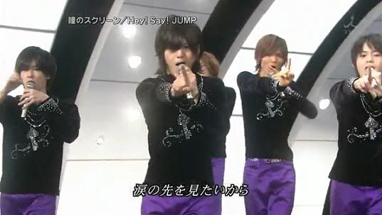
The outfits that make them look like professional figure skaters rather than idols. Wearing them would have ruined the video completely.
I was actually surprised by how equal the camera time was. Even though Ryosuke dominates the song he doesn't dominate the PV. He gets exactly the same amount of camera time as everyone else. Which is awesome. I love Ryosuke and all, but he's gets way too much attention. It's nice to see everyone else for a change. Though the screen time is great I'm a little sad that this video doesn't have any dancing. I guess since their last 2 PVs were so focused on dancing they wanted to do something different this time around. But still, I miss it. Granted the dancing is boarder line silly, because right now it has just enough Johnny's cheese. I'm just used to seeing HSJ dancing in every video.
Another thing that disappoints me is there's a lot of bad hair going on in this video.
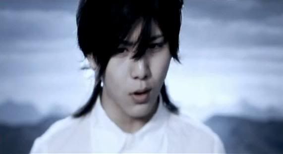
I'm not liking Ryosuke's hair in the close up at all.

But during the fight scenes I love his hair. For some reason the weird ponytail hairstyle they gave him doesn't work face on.

Inoo's hair in the close up is equally gross. Which is sad because I love Inoo.
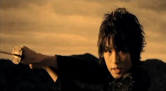
But again it looks fine in the fight scenes. I don't know what's going on. They must keep filming from bad angles.
I'm not a fan of Chinen at all, but his hair is seriously ugly.
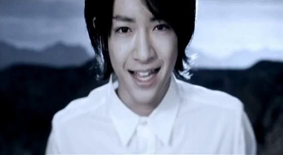
He's still looking ugly as ever, but his hair is making it worse.
For the most part everyone else looks great. Especially Keito. Which is really surprising. Keito usually looks too much like an Alien for my taste.

But in this video he looks really sexy.
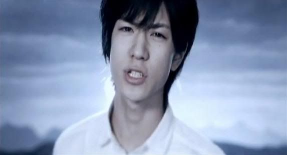
And of course Yuto is looking really great.
However, I'm not a fan of the necklace he has to wear.
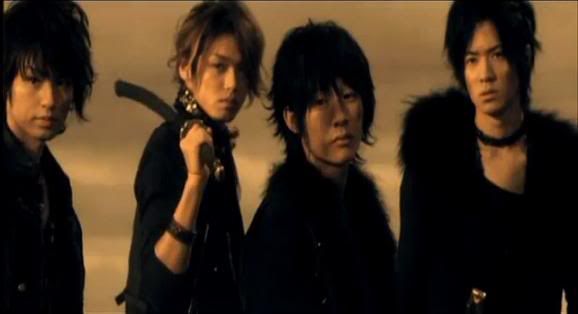
Makes him look pretty gay. :/
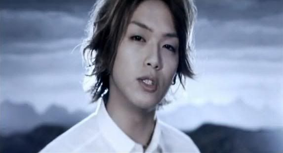
And Takaki's pretty much looking as womanly as ever.
Another thing I love about this video is the amount of stupid faces everyone makes. Because they have to make intense "I'm fighting someone" faces
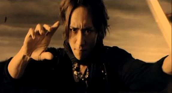
Hikaru usually makes similar faces regardless. So this isn't much of a change.
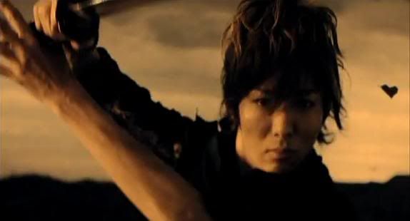
This is exactly a flattering picture of Yabu.
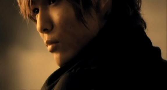
That's better. ;]
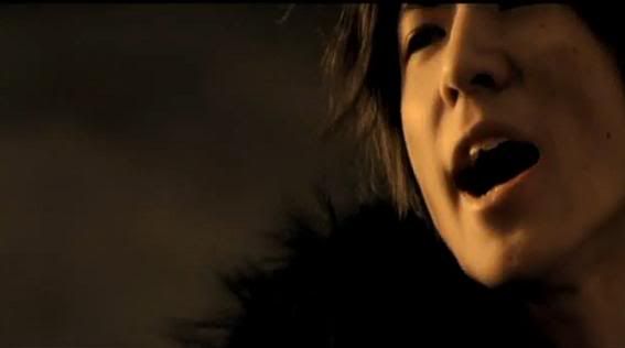
That's not really menacing at all.
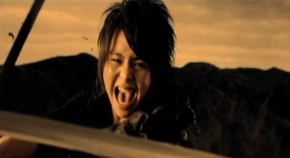
Daiki definitely wins for most loltastic fighting

Chinen fails.
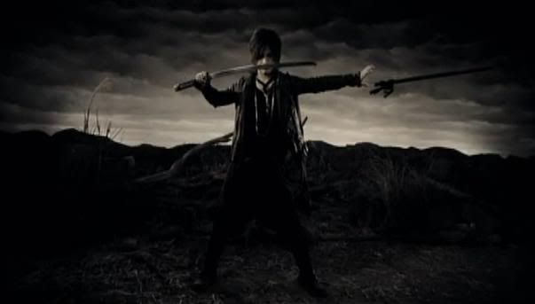
But Ryosuke wins.
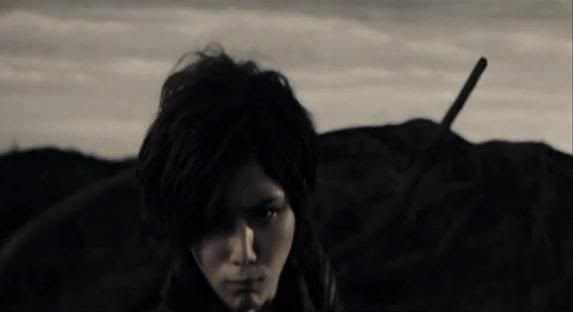
Well almost.
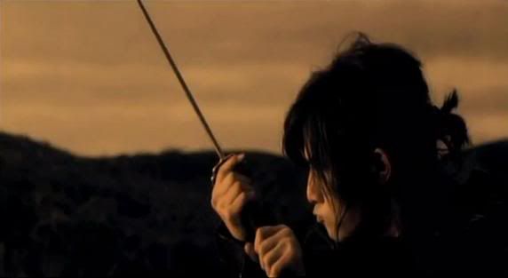
XD


2 comments:
YURI CHINEN is definitely not ugly!
Whatever that thing you see him us ugly is his beauty which only us can see. Sorry, but we are reallly offended...
In my eyes he is. There's just nothing visually appealing about him to me.
I do understand where you are coming from though. But remember that one person's attractive is another person's ugly.
I'm sorry but you have absolutely no reason to be offended. This is merely my opinion on him. You can think attractive all you want, because you are entitled to your opinion. Just like I am entitled to mine.
Post a Comment